動作環境
WordPress 5.1
Create Guten Block
Create Guten Blockの導入は下記も参考にしてください。
Create Guten BlockでGutenbergのカスタムブロック開発環境を構築する
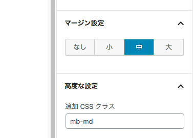
完成イメージ
段落のマージンをボタンで切り替えて調節できるようにしてみます。
コンポーネントの読み込み
最初に必要なコンポーネントを読み込みます。
block.js
const { assign } = lodash;
const { __ } = wp.i18n;
const { Fragment } = wp.element;
const { addFilter } = wp.hooks;
const {
	PanelBody,
	RadioControl
} = wp.components;

const {
	InspectorControls,
} = window.wp.editor;

const { createHigherOrderComponent } = wp.compose;
拡張するブロックの設定
拡張するブロックを選択します。
ここでは「段落」「リスト」「イメージ」のブロックをカスタマイズします。
cconst isValidBlockType = ( name ) => {
	const validBlockTypes = [
		'core/paragraph',   // 段落
		'core/list',        // リスト
		'core/image'        // イメージ
	];
	return validBlockTypes.includes( name );
};
エディター起動時に実行されるフィルター
blocks.registerBlockTypeはエディター起動時に一度だけ実行されるフィルターです。
marginSettingというカスタム属性を設定できるようにします。
export function addAttribute( settings ) {
	if ( isValidBlockType( settings.name ) ) {
		settings.attributes = assign( settings.attributes, {
			marginSetting: {
				type: 'string',
			},
		} );
	}
	return settings;
}
addFilter( 'blocks.registerBlockType', 'myblock/add-attr', addAttribute );
サイドバーの設定
editor.BlockEditにはサイドバーのUIの設定をします。
今回はボタンを切り替えるような動作をしたかったのでRadioControlコンポーネントを使用します。
「高度な設定」に直接入力している可能性もあるので、その辺りの処理もしています。
export const addBlockControl = createHigherOrderComponent( ( BlockEdit ) => {
	return ( props ) => {
		// isValidBlockType で指定したブロックが選択されたら表示
		if ( isValidBlockType( props.name ) && props.isSelected ) {
			// すでにオプション選択されていたら
			let selectOption = props.attributes.marginSetting || '';
			return (
				<Fragment>
					<BlockEdit { ...props } />
					<InspectorControls>
						<PanelBody title="マージン設定" initialOpen={ false } className="margin-controle">
							<RadioControl
								selected={ selectOption }
								options={ [
									{ label: 'なし', value: '' },
									{ label: '小', value: 'mb-sm' },
									{ label: '中', value: 'mb-md' },
									{ label: '大', value: 'mb-lg' },
								] }
								onChange={ ( changeOption ) => {
									let newClassName = changeOption;

									// 高度な設定で入力している場合は追加する
									if (props.attributes.className) {
										// 付与されているclassを取り出す
										let inputClassName = props.attributes.className;
										// スペース区切りを配列に
										inputClassName = inputClassName.split(' ');
										// 選択されていたオプションの値を削除
										let filterClassName = inputClassName.filter(function(name) {
											return name !== selectOption;
										});
										// 新しく選択したオプションを追加
										filterClassName.push(changeOption);
										// 配列を文字列に
										newClassName = filterClassName.join(' ');
									}
									// 新しく選択したオプションをselectOptionに
									selectOption = changeOption;
									props.setAttributes({
										className: newClassName,
										marginSetting: changeOption
									});
								} }
							/>
						</PanelBody>
					</InspectorControls>
				</Fragment>
			);
		}
		return <BlockEdit { ...props } />;
	};
}, 'addMyCustomBlockControls' );

addFilter( 'editor.BlockEdit', 'myblock/block-control', addBlockControl );
やっていることは、18行目のoptionsに設定したvalueをクラス名で割り当てることによって、スタイルを切り替えしてます。
保存処理
blocks.getSaveContent.extraPropsで保存時の処理を設定できます。
マージンを「なし」に選択されている場合はattributesの削除を行なっています。
export function addSaveProps( extraProps, blockType, attributes ) {
	if ( isValidBlockType( blockType.name ) ) {
		// なしを選択した場合はmarginSetting削除
		if (attributes.marginSetting === '') {
			delete attributes.marginSetting;
		}
	}
	return extraProps;
}
addFilter( 'blocks.getSaveContent.extraProps', 'myblock/add-props', addSaveProps )
エディタースタイルの設定
最後にラジオボタンで追加されるクラスのスタイルを作成します。
あと、ラジオボタンを通常のボタン風にみせかたったのでここで設定してます。
editor-style.scss
.edit-post-visual-editor {
	.mb-sm {
		margin-bottom: 2em;
	}
	.mb-md {
		margin-bottom: 3em;
	}
	.mb-lg {
		margin-bottom: 4em;
	}
}

// ラジオボタンをボタンのような表示にする
.margin-controle {
	.components-radio-control {
		.components-base-control__field {
			display: flex;
		}

		&__option {
			width: 100%;

			input {
				display: none;
			}

			input[type="radio"]:checked + label {
				background-color: #0085ba;
				color: #fff;
				text-shadow: 0 -1px 1px #005d82, 1px 0 1px #005d82, 0 1px 1px #005d82, -1px 0 1px #005d82;
			}

			label {
				display: block;
				cursor: pointer;
				width: 100%;
				margin: 0;
				padding: 9px 5px;
				background: #f7f7f7;
				color: #555e64;
				text-align: center;
				line-height: 1;
				transition: .2s;
				border: solid 1px #ccc;
				border-left-style: none;
				box-shadow: inset 0 -1px 0 #ccc;

				&:hover {
					background: #fafafa;
					border-color: #999;
					box-shadow: inset 0 -1px 0 #999;
					color: #23282d;
				}
			}
			&:first-child label {
				border-radius: 3px 0 0 3px;
				border-left-style: solid;
			}
			&:last-child label {
				border-radius: 0 3px 3px 0;
			}
		}
	}
}
このファイルはeditor-style.cssという名前でcssに書き出したら、使用しているテンプレートディレクトリに配置して、functions.phpに下記のように記述して読み込みます。
add_action( 'enqueue_block_editor_assets', 'gutenberg_stylesheets_custom_demo' );
function gutenberg_stylesheets_custom_demo() {
  wp_enqueue_style( 'theme-editor-style', get_theme_file_uri('/editor-style.css') );
}
もっといい方法があるような気がしますが、とりあえず動いていているということで以上になります。
参考サイト:
Add a custom sidebar panel to Gutenberg – richardtape.com