HTML
HTMLは基本この形です。特別なことはないですね。
HTML
<section class="section1">
	<h2>SECTION 01</h2>
</section>
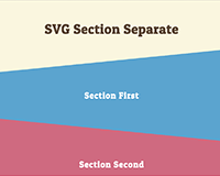
横型ストライプ
横型のストライプはrepeating-linear-gradientを使うと簡単ですね。
アニメーションはkeyframesで設定します。
nfinite linearで無限にスクロールするようになります。
CSS
@keyframes move-stripe1 {
	0% {  background-position-y: 0;  }
	100% {  background-position-y: -50px;  }
}
.section1 {
	background: repeating-linear-gradient(#00b1ff, #00b1ff 25px, #8be4fc 0, #8be4fc 50px);
	animation: move-stripe1 .8s infinite linear
}
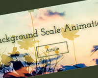
斜め型のストライプ
斜め型はサイズ感がわからなかったので画像を作成しました。

基本やってること変わらないですが、keyframesをbackground-position-xにして移動方向を変えてます。
CSS
@keyframes move-stripe2 {
	0% {  background-position-x: 0;  }
	100% {  background-position-x: -34px;  }
}
.section2 {
	background: url("img/01.png");
	animation: move-stripe2 1s infinite linear;
}
テキストに斜め型のストライプ
background-clipなるものを使えばテキストの背景も設定できるんです。
IEは対応していないので実際使用するには分岐の処理が必要になります。
CSS
@keyframes move-stripe3 {
	0% {  background-position-x: 0;  }
	100% {  background-position-x: -27px;  }
}
.section3 h2 {
	background: url("img/02.png");
	-webkit-background-clip: text;
	-webkit-text-fill-color: transparent;
	animation: move-stripe3 1.5s infinite linear;
}
以上。簡単なわりにわりと効果ありそうな気がしてます。