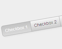
HTMLですJSを使えばもっとスマートにできると思いますが、今回はCSSだけにしてるので長めになってます。
HTML
<ul class="check-card">
	<li class="check-card-item">
		<input type="checkbox" id="check01" name="check" value="1">
		<label for="check01" class="radio"></label>
		<div class="check-card-bg"></div>
		<div class="check-card-body">
			<div class="check-card-toggle">
				<span></span>
				<span></span>
			</div>
			<div class="check-card-body-in">
				<h3 class="check-card-title">CARD ITEM 01</h3>
				<p class="check-card-description">
					Card item description
				</p>
			</div>
			<div class="check-card-cancel">CANCEL</div>
		</div>
	</li>
</ul>
CSS
.check-card {
	list-style: none;
	margin: 40px auto;
	width: 320px;
}
.check-card .check-card-item {
	position: relative;
	width: 100%;
	float: left;
	margin: 0 1% 15px;
	font-size: 16px;
	background: #3c9895;
	overflow: hidden;
}
.check-card li label {
	display: block;
	position: absolute;
	height: 300px;
	width: 100%;
	z-index: 100;
	cursor: pointer;
}
.check-card .check-card-body {
	height: 300px;
	color: #fff;
	z-index: 2;
	position: relative;
}
.check-card .check-card-body-in {
	padding: 40px 20px 20px;

}
.check-card .check-card-title {
	font-size: 32px;
	margin-bottom: 5px;
}
.check-card .check-card-bg,
.check-card .check-card-toggle {
	position: relative;
	background: #2e2d37;
	width: 36px;
	height: 36px;
	top: 10px;
	left: 10px;
	-webkit-border-radius: 50%;
	border-radius: 50%;
}
.check-card .check-card-bg {
	position: absolute;
	background: #2e2d37;
	-webkit-transition: all .3s ease-out;
	transition: all .3s ease-out;
	-webkit-transform:scale(1);
	transform:scale(1);
	z-index: 0;
}
.check-card .check-card-toggle span {
	position: absolute;
	display: block;
	width: 20px;
	margin-left: -10px;
	height: 1px;
	top: 50%;
	left: 50%;
	background: #fff;
	-webkit-transition: all .4s ease-out;
	transition: all .4s ease-out;
	-webkit-transform: rotate(-270deg);
	transform: rotate(-270deg);
}
.check-card .check-card-toggle span:first-child {
	-webkit-transform: rotate(180deg);
	transform: rotate(180deg);
}
.check-card .check-card-cancel {
	font-size: 18px;
	border-top: solid 1px #fff;
	border-bottom: solid 1px #fff;
	padding: 10px 0 7px;
	text-align: center;
	position: absolute;
	bottom: -50px;
	margin: 0 7%;
	width: 86%;
	-webkit-transition: all .3s cubic-bezier(0.5, -0.8, 0.5, 1.8);
	transition: all .3s cubic-bezier(0.5, -0.8, 0.5, 1.8);
}
.check-card input[type=checkbox] {
	display: none;
}
.check-card input[type=checkbox]:checked ~ .check-card-body .check-card-toggle span {
	-webkit-transform: rotate(0deg);
	transform: rotate(0deg);
}
.check-card input[type=checkbox]:checked ~ .check-card-body .check-card-toggle span:first-child {
	-webkit-transform: rotate(0deg);
	transform: rotate(0deg);
}
.check-card input[type=checkbox]:checked ~ .check-card-bg {
	-webkit-transform:scale(25);
	transform:scale(25);
}
.check-card input[type=checkbox]:checked ~ .check-card-body .check-card-cancel {
	bottom: 30px;
}
チェックボックスは「input[type=checkbox]:checked ~」の後にセレクタを書けば隣接した要素がチェックボックスに連動するのでデザイン的に色々できますね。